About 81 minutes
The 1990 United States Census [2nd] — A Closer Reading
Dictionaries Reference
18,532 recorded words. 53 minutes difference from this book's estimate.
View Gutenberg source #37

Before opening United States Census Figures Back to 1630 — Key Ideas to Explore, the edition data offers a quick orientation: 6,363 words, 28 min estimated reading time, and 23 detected text sections.
The text analysis averages about 0.1 words per sentence, while the detected sections provide another way to judge how the source is divided.
Project Gutenberg metadata also associates the work with “United States -- Population -- Statistics,” connecting these edition facts with the source record’s subject description.
Explore this collection
These alternatives are selected using recorded categories and estimated reading time.
About 81 minutes
Dictionaries Reference
18,532 recorded words. 53 minutes difference from this book's estimate.
View Gutenberg source #37About 101 minutes
Dictionaries Reference
23,008 recorded words. 73 minutes difference from this book's estimate.
View Gutenberg source #9188About 426 minutes
Dictionaries Reference
97,804 recorded words. 398 minutes difference from this book's estimate.
View Gutenberg source #43417Search stored excerpts and compare books → Choose by your preferences →
Choices use stored catalog measurements. Estimates vary with reading speed. A shared category is a catalog label, not a claim that two books have the same argument or literary quality.
Search reads excerpt text stored with this catalog and links to its associated Gutenberg record. The connection is stored in the site database; this tool does not recheck that every excerpt is word-for-word identical to that external record. Excerpt search does not cover every chapter and does not verify historical publication dates.
Catalog snapshot checked: 2026-09-26. Coverage: 93 public books, 93 available source excerpts.
Calculated from edition completeness, EPUB availability, text structure and catalogue metadata. Not a user rating.
Total of 100 points, scaled to a 2.5-5.0 range. Editions with an empty description or a missing EPUB file are not scored.
Public-domain source text
The source text is kept in the dedicated reader, separate from this catalogue record and its commentary.
This work presents a table of United States population figures extending back to 1630, compiled from Census Bureau data and supplemented with estimates for years after 1992. The editors have averaged multiple figures for certain years and applied a 1% growth rate projection based on the average from 1972–1992. The raw data is appended as a footnote, and dates not otherwise specified are presumed to be July 1.
The editorial preface frames the table as a tool for correcting misinterpretations of percentage increases in reports—for instance, an apparent rise in educational attainment may actually be a decline once population growth is factored in. This cautionary note sets the stage for the statistical data that follows.
The work opens with a substantial editorial preface before any table appears. This preface explains the methodology—averaging figures, estimating post-1992 data, and the rationale for a 1% growth rate—and then delivers a pointed lesson on how to read percentage changes in context. The editors use a hypothetical example about grade school diplomas to illustrate that a reported 5% increase could actually be a 5% decrease when population growth is accounted for. This framing is not merely explanatory; it shapes how the reader should approach the numbers. The table itself is presented without further commentary, leaving the preface as the interpretive key.
The table columns—year, population in millions, growth factor, and percentage growth—repeat a pattern of decimal precision that invites close reading. For example, the 1870 entry shows a negative growth rate (-1.0968%), a rare dip that stands out among otherwise positive figures. The 1860s show a cluster of high growth rates (e.g., 5.9947% in 1871, 2.9504% in 1861), while the 1930s entries hover near 1%. The consistent four- or five-decimal-place precision (e.g., 1.928101 for 1930) gives an illusion of exactness, yet the preface reminds us these are often averages or estimates. This tension between precision and estimation is a recurring motif.
The transition from the editorial preface to the statistical table is abrupt. The preface ends with a footnote explanation about demographic analysis, then the table begins without a heading or introduction. This shift mirrors the work's dual nature: part methodological essay, part raw data repository. The reader must hold the preface's warnings in mind while scanning the columns. Later, the text shifts again to Project Gutenberg boilerplate, which is unrelated to the census data. This juxtaposition of analytical preface, numerical table, and legal/licensing text creates a disjointed reading experience that underscores the work's status as a compiled document rather than a unified narrative.
The editors repeatedly emphasize the 1% average growth rate from 1972–1992 as the basis for post-1992 estimates. This figure appears in the preface and implicitly governs the table's later entries. Yet the table itself shows considerable variation: growth rates range from -1.0968% (1870) to 5.9947% (1871). The 1% average masks these fluctuations. The preface's hypothetical example about education also hinges on a 10% population increase over a decade, which corresponds roughly to a 1% annual rate. This recurring detail ties the methodological choice to the interpretive lesson, making the growth rate a central, if understated, theme.
Readers should approach the table with the preface's caution in mind: raw population figures and percentage changes can mislead if growth is not accounted for. The work is best used as a reference for specific years, but its value lies equally in the editorial framework that teaches how to interpret such data. For a fuller understanding, consult the appended raw data and consider demographic breakdowns by age group, as the preface suggests.
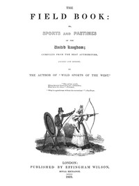
That rainy afternoon, the census tables felt less like numbers and more like a long exhale of lives lived. Staring at growth curves, I wondered what those souls did for joy. The thought led me, almost accidentally, to The Field Book: or, Sports and pastimes of the United Kingdom compiled from the best authorities, ancient and modern — Background and Themes, a gentler kind of statistic, one measured in laughter and idle hours.
Create a short personal record of your experience with this book.
![Cover of The 1990 United States Census [2nd] — A Closer Reading](https://frouu.com/storage/media/covers/pg37.jpg)